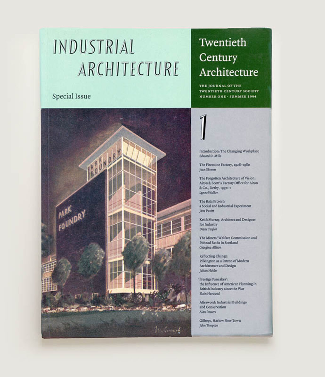
Twentieth Century Architecture I
Industrial Architecture
Twentieth Century Society
1994 | 264 × 196mm | 96pp

The Start of a Series. The first of ten issues of the Journal of the Twentieth Century Society produced between 1994 and 2012. The text setting is an early showing of Fred Smeijers's now classic Quadraat; the display typeface is Festival Titling, designed by Philip Boydell for the Festival of Britain in 1951. I had chosen the latter for an earlier commission to design a logo and stationery for the Society, on the basis that 1951 was bang in the middle of the twentieth century and so an even-handed choice from the fast-changing typographical fashions of one hundred years. The other nine journals can be seen here.