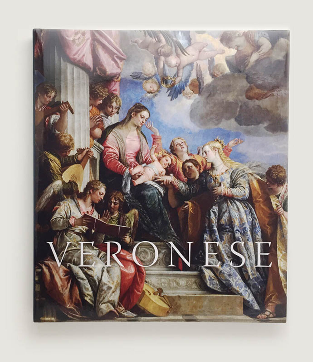
Veronese
Magnificence in Renaissance Venice
The National Gallery
2014 | 285 × 245mm | 272pp
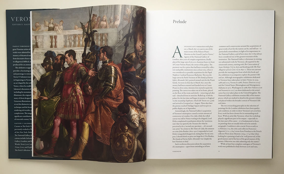
Old Masters on a Grand Scale. The sixth catalogue designed for The National Gallery, but the first for one of their major exhibitions. The paintings were so large that the show outgrew the usual exhibition space and was displayed in a suite of main floor galleries.
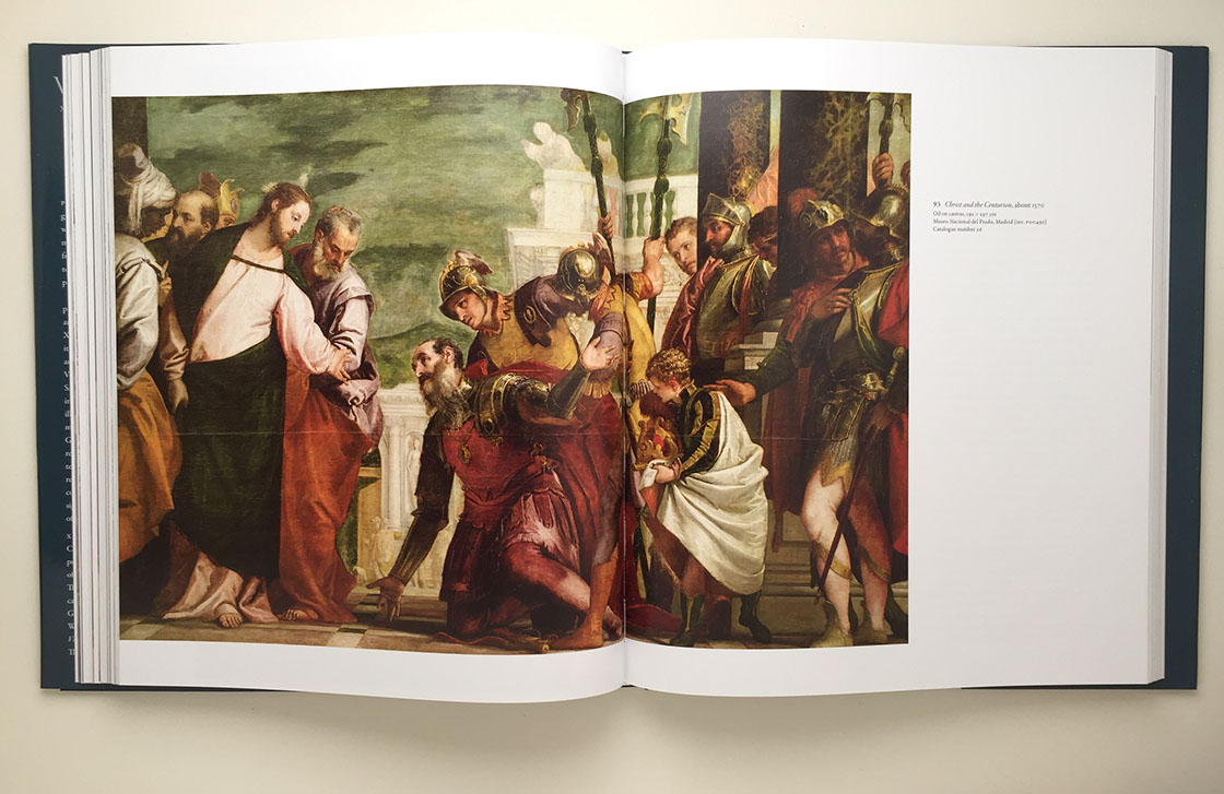
Rather than a sequence of illustrated catalogue spreads, the author wrote a continuous narrative of the artist's life and work. The skill here is to try to size and position the illustrations so that they run in close sequence with the text; the frustration is that if something is added, moved or resized, the whole house of cards can come crashing down.
The display typeface is Robert Slimbach's Warnock. Although it appears historically appropriate it is named after John Warnock, the co-founder of Adobe, the company responsible for so many major advances in desktop publishing and graphic arts software.